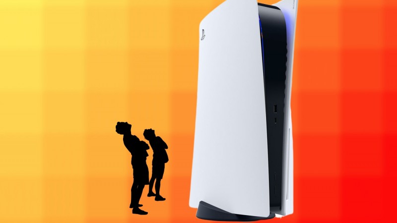
A common talking point about the PlayStation 5 is its massive size, so imagining an even bigger console is a tough concept to grasp. It turns out, the initial designs for the latest generation of gaming was originally a lot bigger than what we see now with the final product. An even bigger PS5? Can you even imagine the memes?
Sony’s Senior Art Director Yujin Morisawa headed the design of the PlayStation 5 and in a recent interview, we not only learned about how nervous he was to reveal his work to the world, but also that the final product was actually a lot smaller than he had intended.
Speaking with The Washington Post, Morisawa revealed that he was “shaking” before the June reveal of the PlayStation 5 system, stating that “there was so much pressure” on him to knock it out of the park. The overt white display with the blue and black accents is a strong departure from the usual PlayStation look, much like how Xbox pivoting wildly with the Series X design. But sometimes, people are scared of change, and that’s what had Morisawa nervous prior to revealing the new look.

“When you design something, you want to make it feel comfortable. Sometimes it looks like a plant or some animal or some object. I think that’s more comfortable than something that’s weird, or something that they’ve never seen before,” Morisawa told the site. While the nerves are understandable, the new design was received quite well with the exception of its size. The jokes about “where will this fit” went rampant, but apparently the size is actually smaller than intended.
“When I started drawing, it was much larger even though I didn’t know what engineering was going to do,” Morisawa explained. “It’s kind of funny that engineering actually told me it’s too big. So, I actually had to shrink it down a little bit from the first drawing.”
Inspired by the term “five dimensions,” Morisawa wanted the PlayStation 5 to give off a feeling of living in a parallel world. Its more artistic style direction certainly shows off a more futuristic ethos for Sony, and does a solid job at making sure people know the PlayStation 5 will be different. With PS5 systems now offering backwards compatibility that’s comparable to Xbox’s, the vision Sony has for gaming is becoming more and more consumer-friendly, especially for those not quite ready to leave the current generation in the past.
What do you think? Could the internet have handled a PlayStation 5 even more “thicccc” than what we see now? If you could change one thing about the design, what would it be? Sound off with your thoughts in the comment section below!
[Souce: The Washington Post]
